Ballarat Removals & Storage • Professional Services
Ballarat Removals & Storage has been helping locals move for over 50 years. A well-established name in the Ballarat community, the business changed hands in 2024, marking the beginning of a fresh chapter with a renewed focus on the future.
Scope
Brand Identity

The Brief
With decades of experience and a strong local reputation, Ballarat Removals & Storage had solid foundations to build on. The change in ownership presented an opportunity to refresh the brand and establish a more contemporary, consistent visual identity.
The brief called for something bold, professional and straightforward. An identity that reflected the company's reliability and efficiency, without losing its down-to-earth character or strong connection to Ballarat.


The Approach
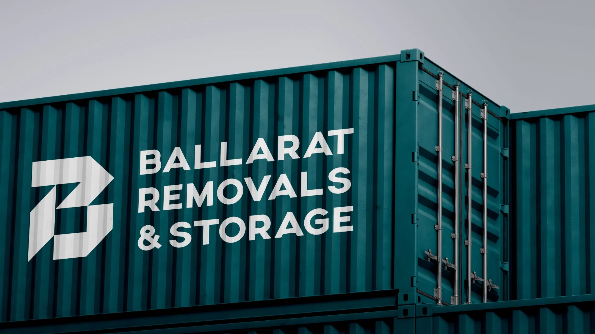
The new identity centres around a custom geometric B brandmark, with angular forms inspired by the shapes of an unfolded moving box. The design plays on the idea of movement and direction, with arrows drawn from the brandmark creating a set of graphic elements that can be used throughout the identity.
Bold typography and a simple palette of black, white and deep teal give the brand a strong, contemporary feel, reflecting the straightforward and dependable nature of the business.
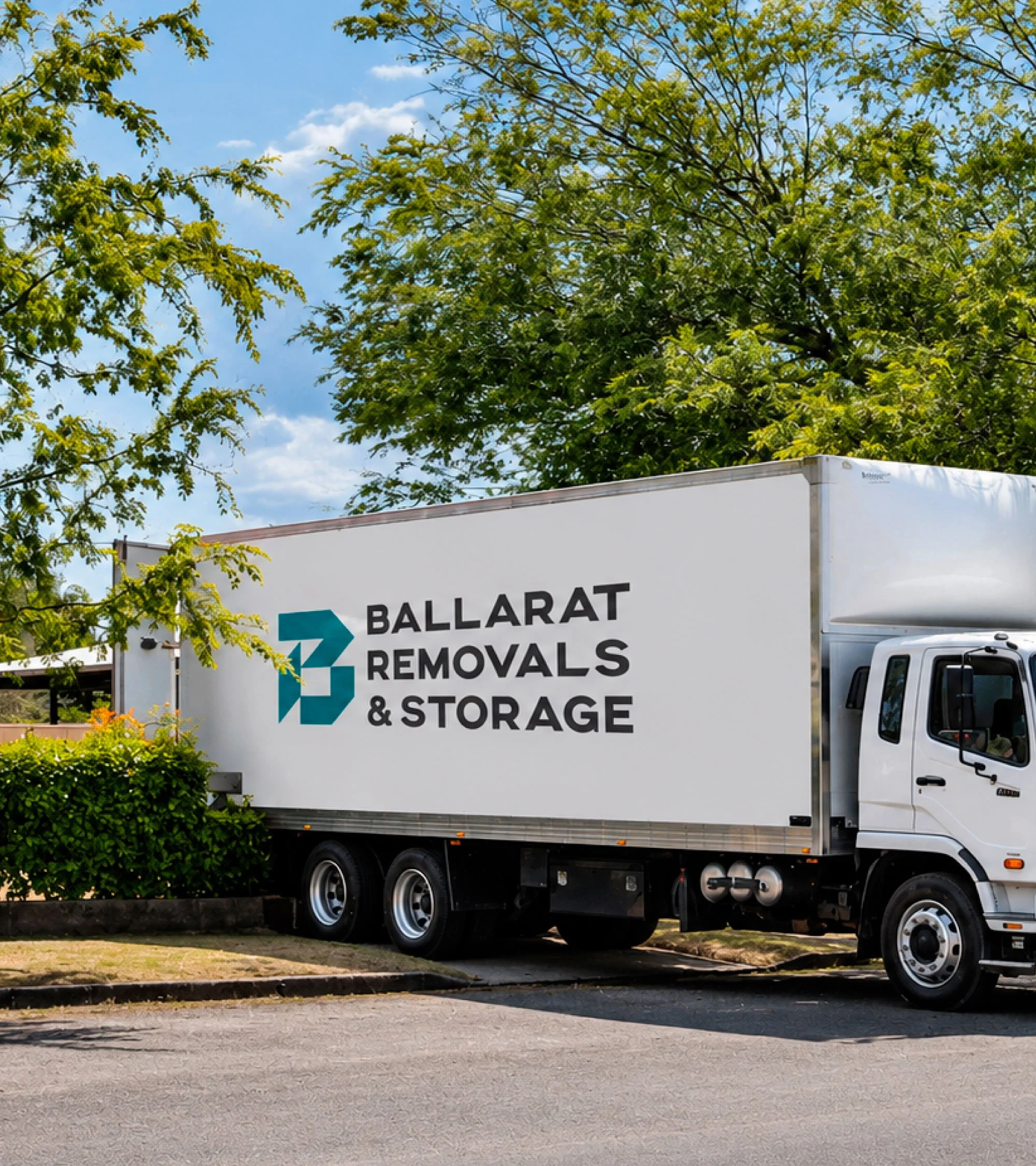
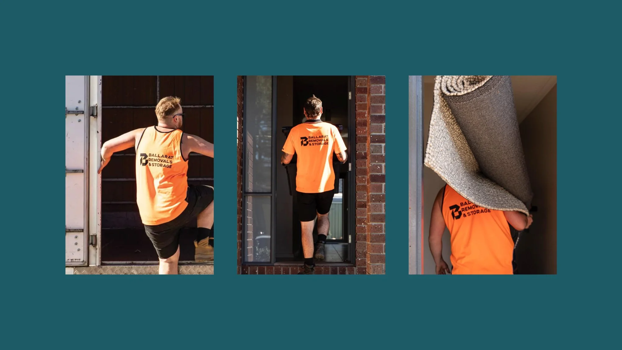
Since handover, the team has enthusiastically embraced the new identity, rolling it out across their vehicles, signage and digital presence, bringing the brand to life in all the right places.