Gabi • Hospitality
Gabi is a neighbourhood bar and restaurant in the heart of Yarraville, from the team behind acclaimed fine diner Navi. With an open charcoal grill, inventive cocktails and a menu made for sharing, Gabi brings a little fine-dining finesse to a more relaxed setting.
Scope
Brand Identity
Business Collateral
Social Media Launch Package
The Brief
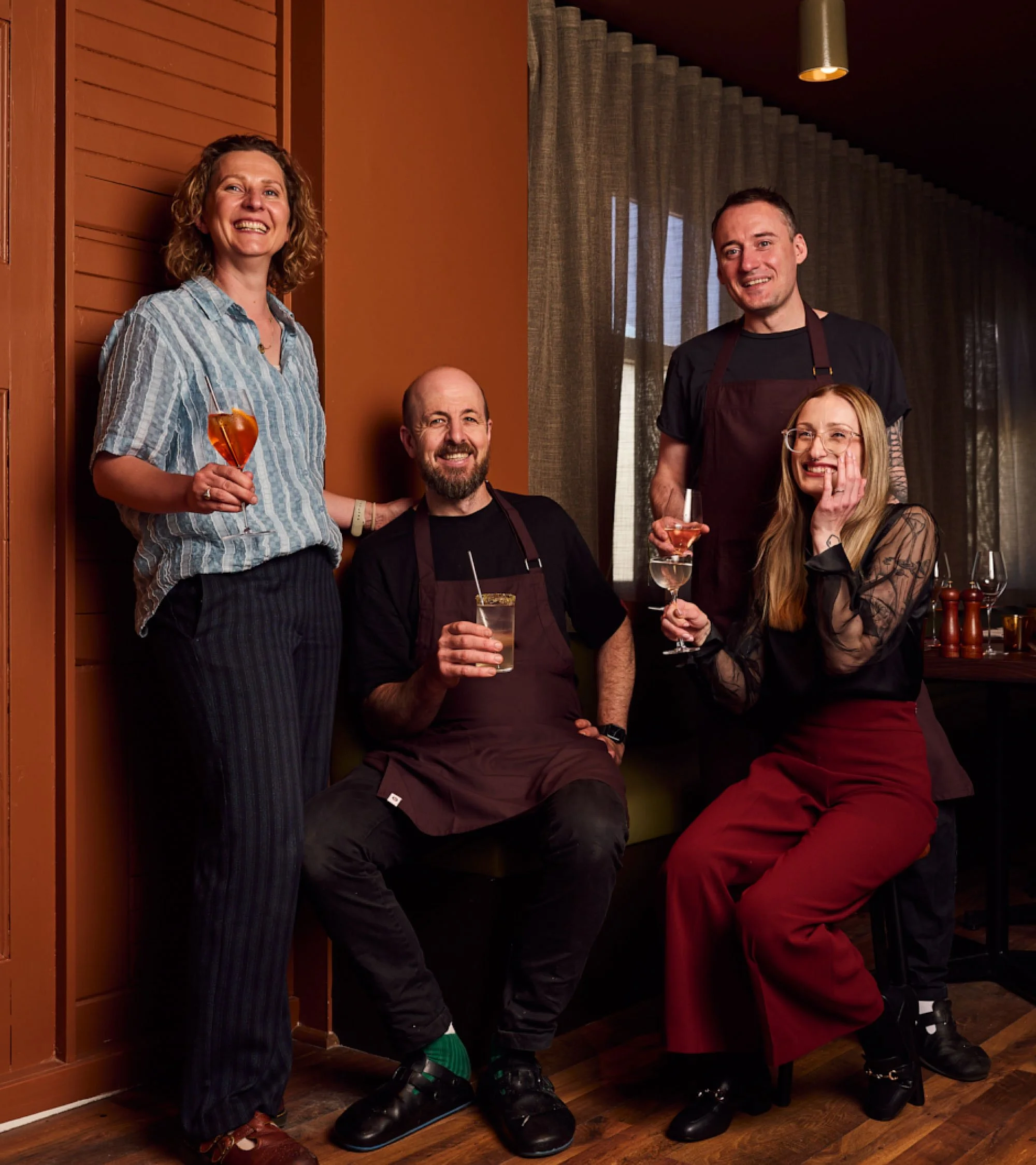
The vision for Gabi was to create a neighbourhood favourite. Somewhere that combined the quality and attention to detail of fine dining with the easygoing atmosphere of a local bar. A place where exceptional food, thoughtful drinks and genuine hospitality could all share the spotlight.
The brief was to develop an identity that reflected this balance, drawing on the sensory experience of charcoal cooking and the subtle 1970s influences of the interior fit-out, while establishing a distinct personality of its own.
The story behind the name was a driving influence in the design. Gabi is named after co-owner Miriam's grandmother, with a nod to Gabija, the Lithuanian spirit of fire and protector of the home. This connection became an important part of the brand's story, tying together the restaurant's focus on cooking over fire and bringing people together.
The Approach
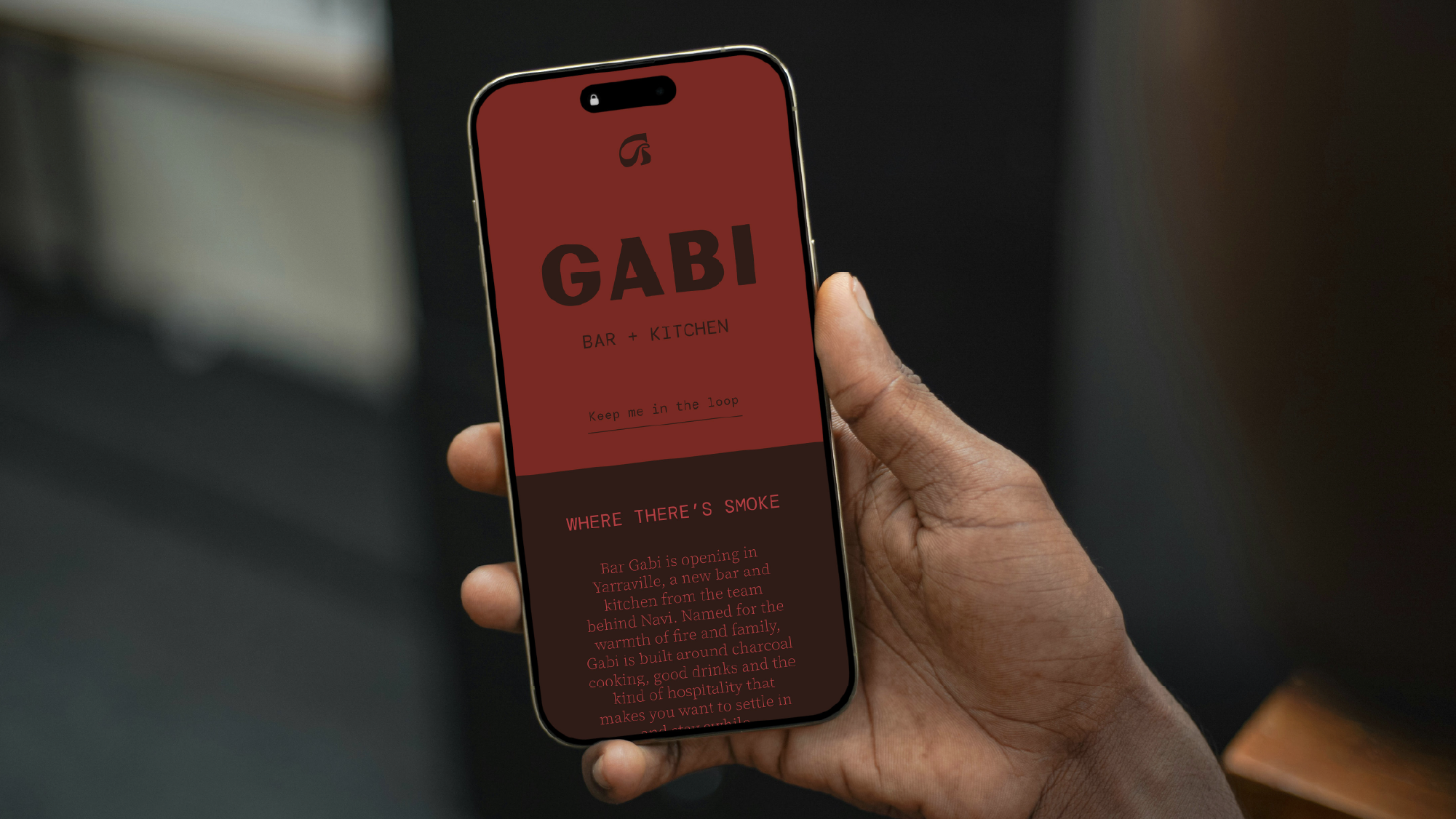
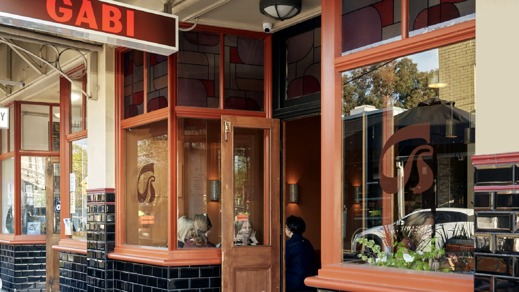
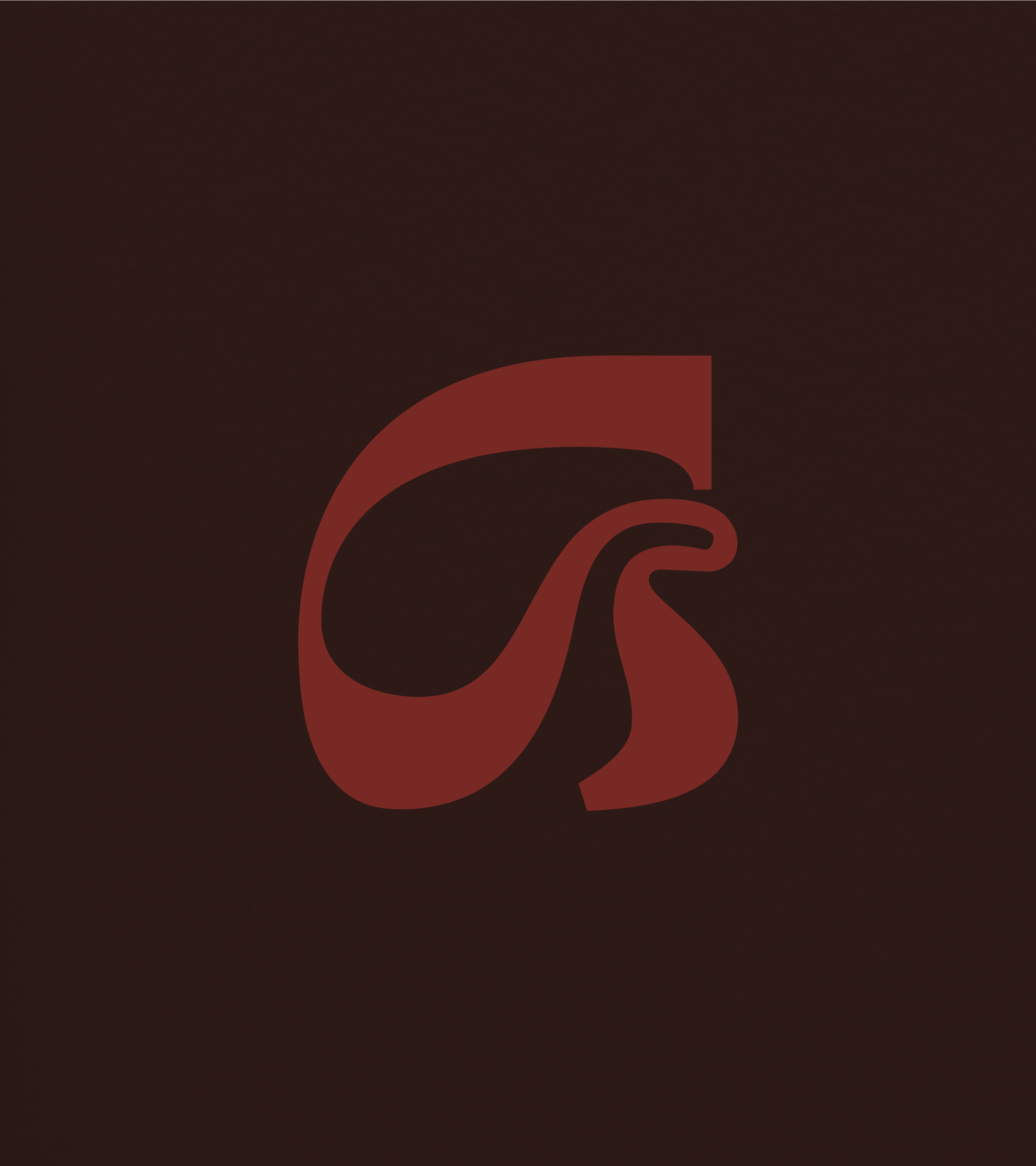
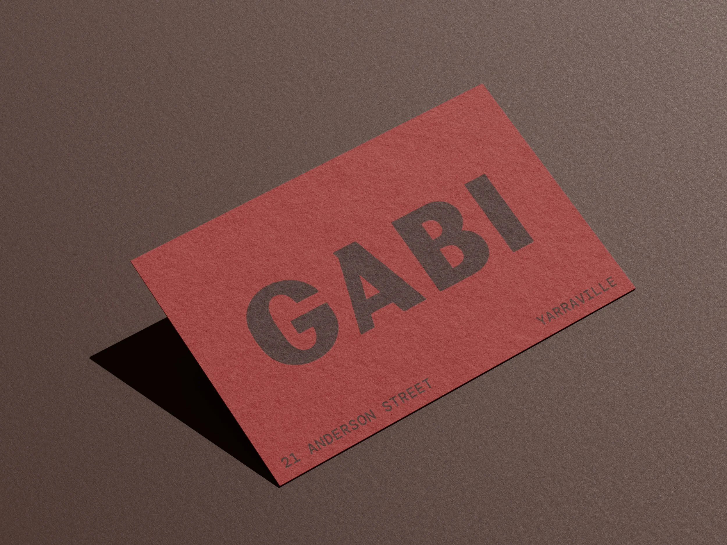
The Gabi identity features a bold, custom wordmark with subtly softened letterforms, paired with an abstract G brandmark that brings a touch of nostalgia. Its flowing, sculptural curves take inspiration from the movement of smoke and flame, creating a connection to the restaurant's charcoal cooking without relying on a literal representation of fire.
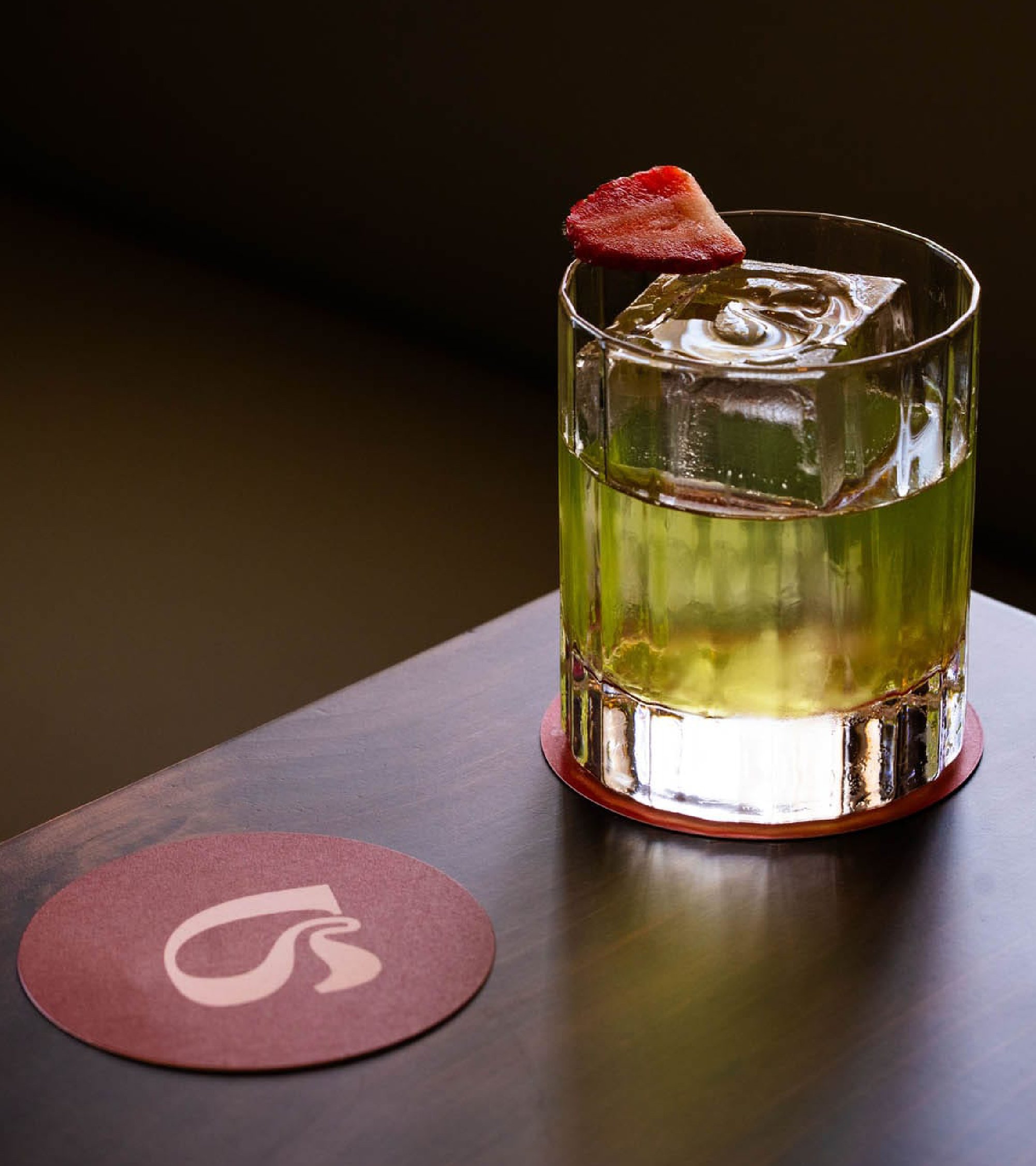
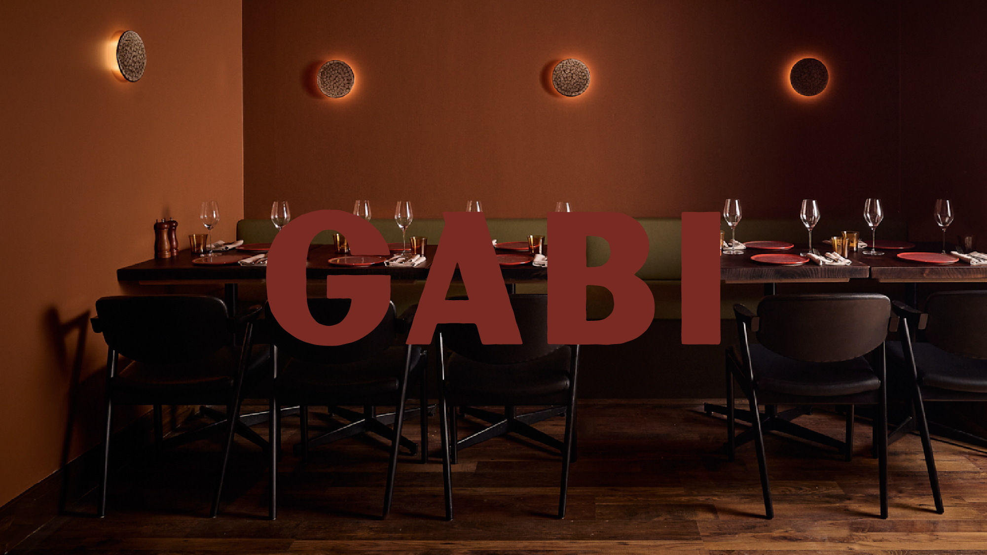
The colour palette draws on the rich, earthy tones of the interiors, bringing together deep reds, chocolate browns and warm neutrals. Brighter accents introduce contrast and a little unexpected energy, while the charcoal-inspired texture references the naturally occurring patterns of burnt wood, adding depth and a tactile quality to the identity.
The result is an identity that feels right at home in Gabi's relaxed setting, with enough personality to make its own impression.