Obi Office • Architecture & Interiors
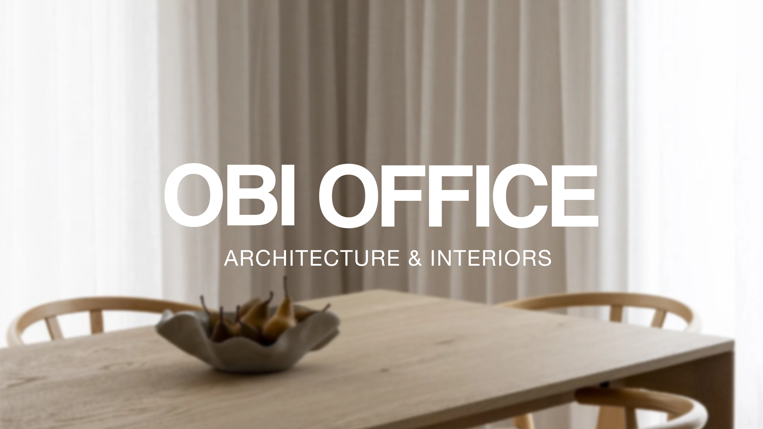
Obi Office is a Ballarat-based architecture and interior design studio creating considered, highly functional spaces across residential and commercial projects. With an established logo already in place, the studio was ready to build on what was there and introduce a little more personality.
Scope
Brand Evolution
Website Design
The Brief
The existing Obi Office logo was clean, recognisable and well suited to the practice, so a complete rebrand wasn't necessary. Instead, the opportunity was to build a more complete visual identity around the existing logo, introducing a supporting brandmark, an expanded colour palette and a more versatile typography system.
The refreshed identity would also form the foundation for a website redesign. While the existing site did the job, its limited visual approach didn't quite capture the character of the studio or effectively showcase its work.
The Approach
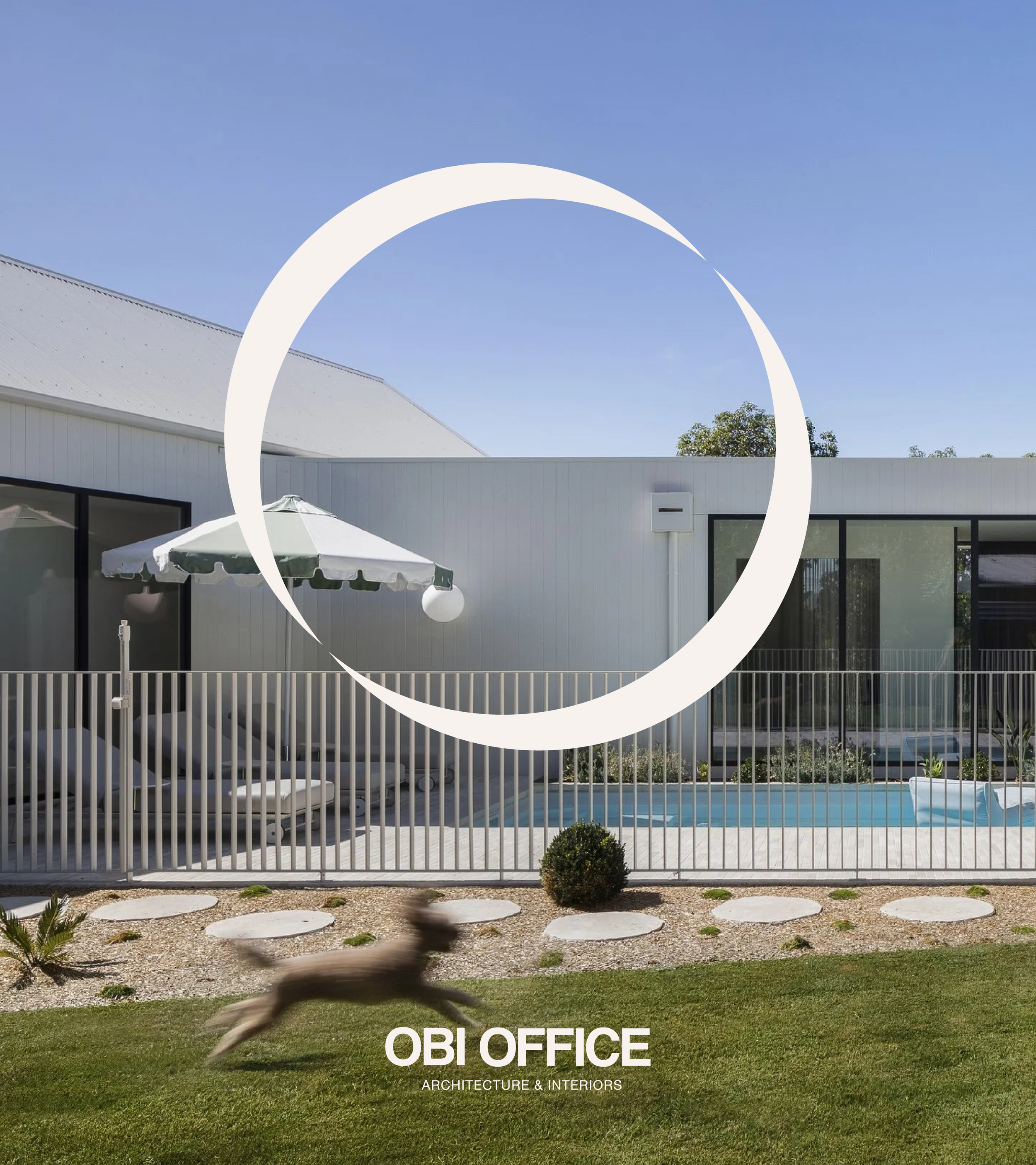
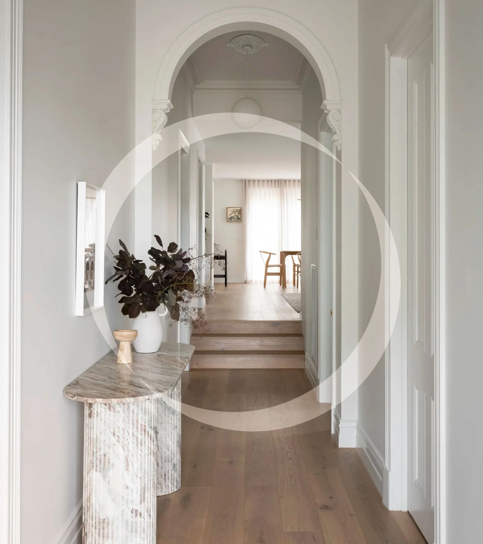
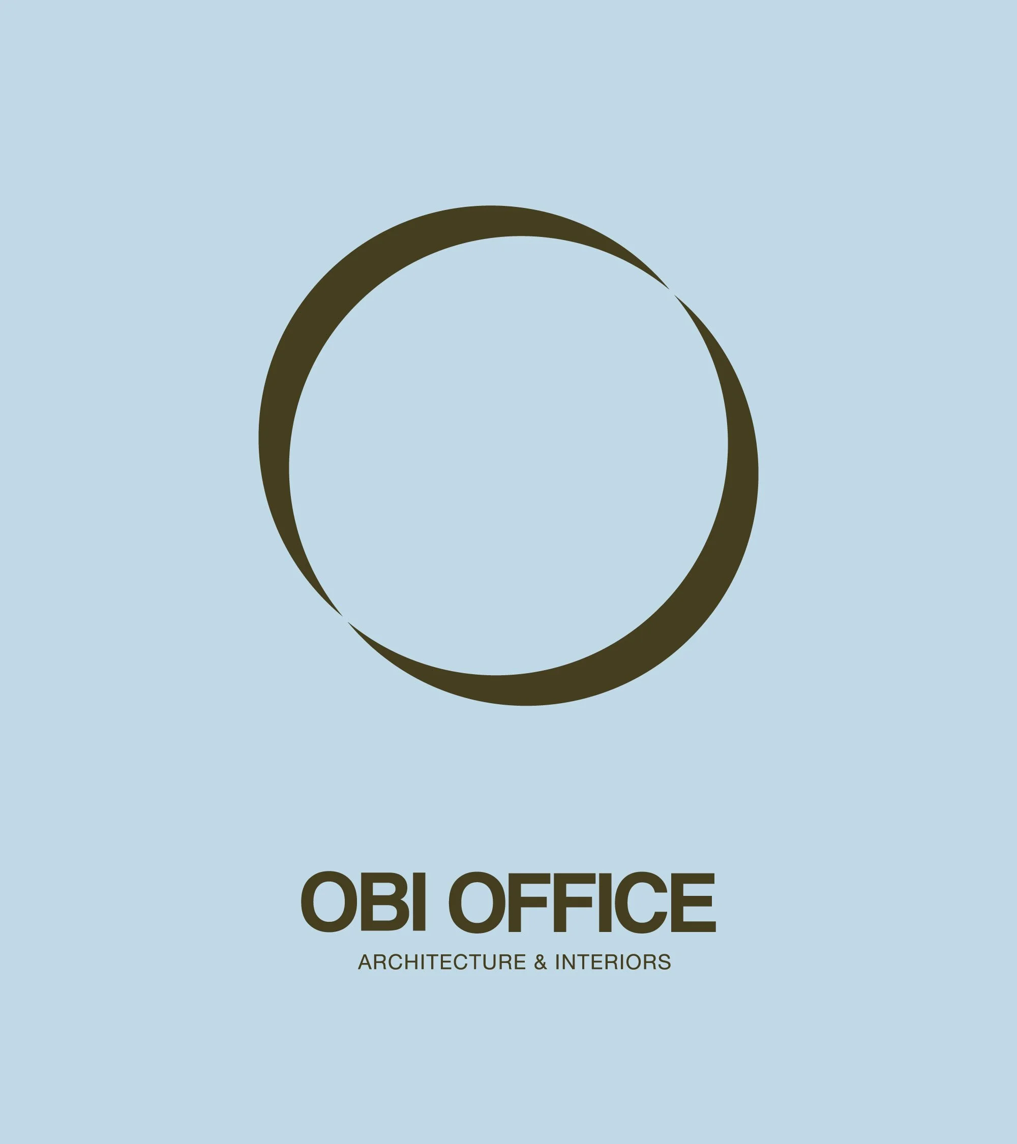
The original wordmark was retained, with subtle refinements to the spacing allowing it to work more effectively in a single colour. A new abstract O brandmark was developed around the relationship between inside and outside, a simple reference to the studio's architectural and interior design practice.
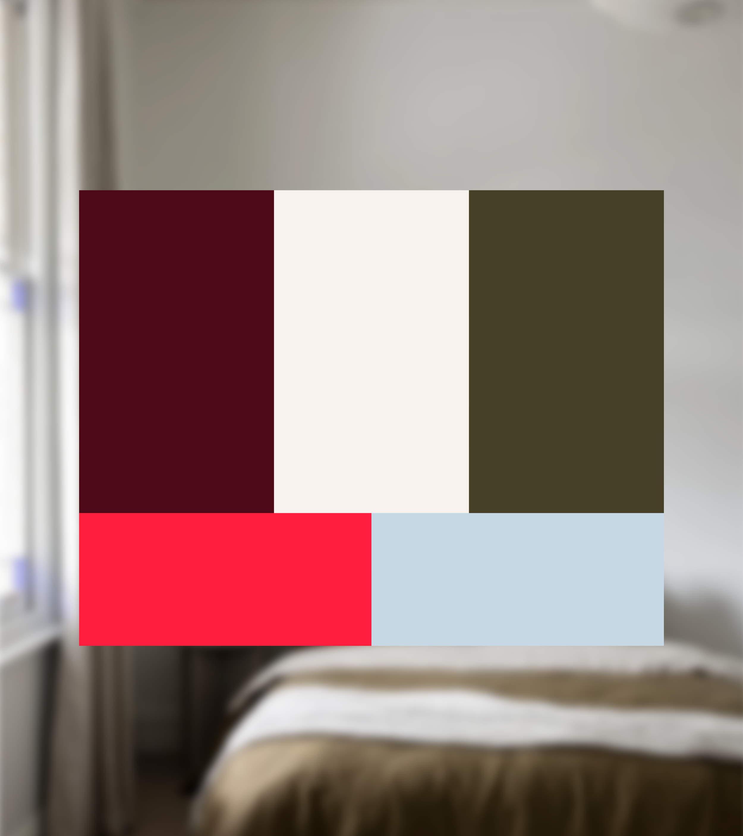
An expanded colour palette introduces warmth, contrast and personality, while updated typography brings greater flexibility across different applications. Together with the new brandmark, these elements transform what was essentially a standalone logo into a more complete and recognisable visual identity.
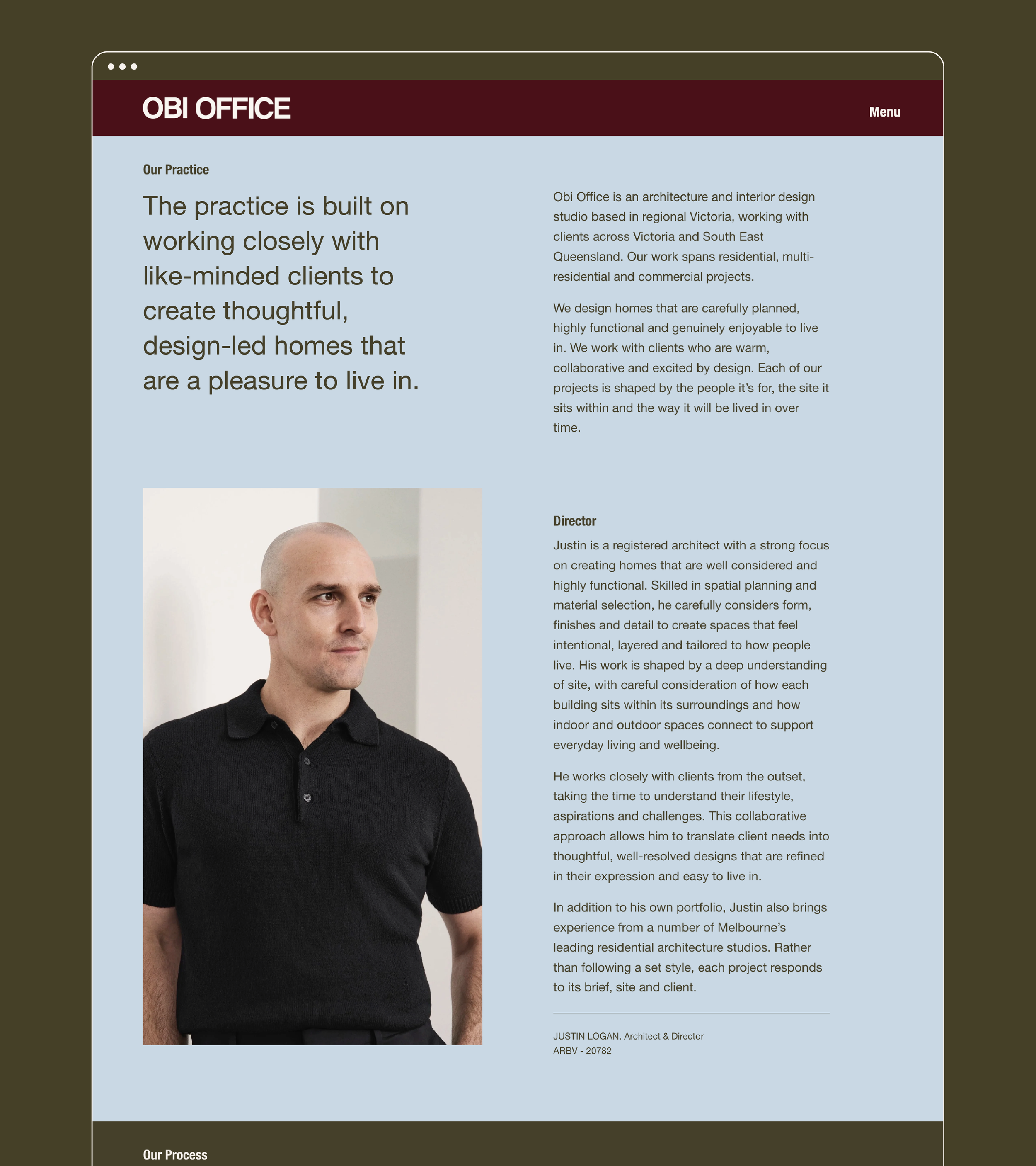
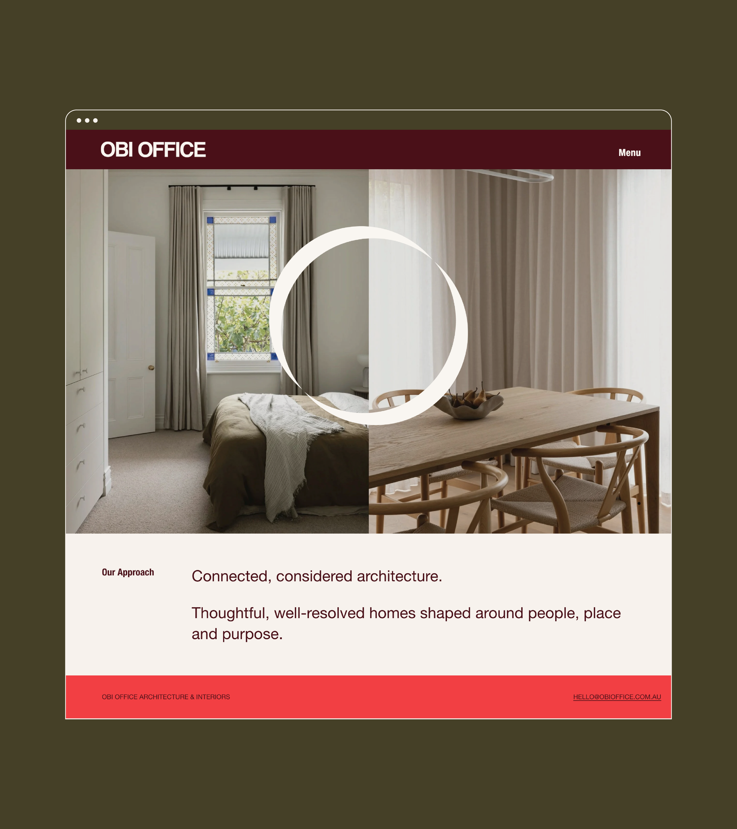
The biggest transformation can be seen in the website redesign. What was previously a minimal, black-and-white website is now a colourful, expressive digital experience that gives the studio a much stronger sense of personality, while staying true to its established identity.